
Feb 14, 2022
5 min read
Case Study: Designing the WarungLelang dashboard to manage Membership & Experience Points
About WarungLelang Dashboard
WarungLelang Dashboard is a dashboard with various features that can make it easier for users, starting from Summary Monitoring in all certain periods of time, setting up various available features ranging from Order Details, Products, Customers, Membership and many more. The WarungLelang dashboard will provide information systematically and provide a good and efficient experience for every user.
Problem and Solution
In my project at KodingWorks this time, which is the design and creation project of the WarungLelang Dashboard, there are a few obstacles in designing the Membership and Experience Point feature settings.
The features that we will design in Membership and Experience Points are:
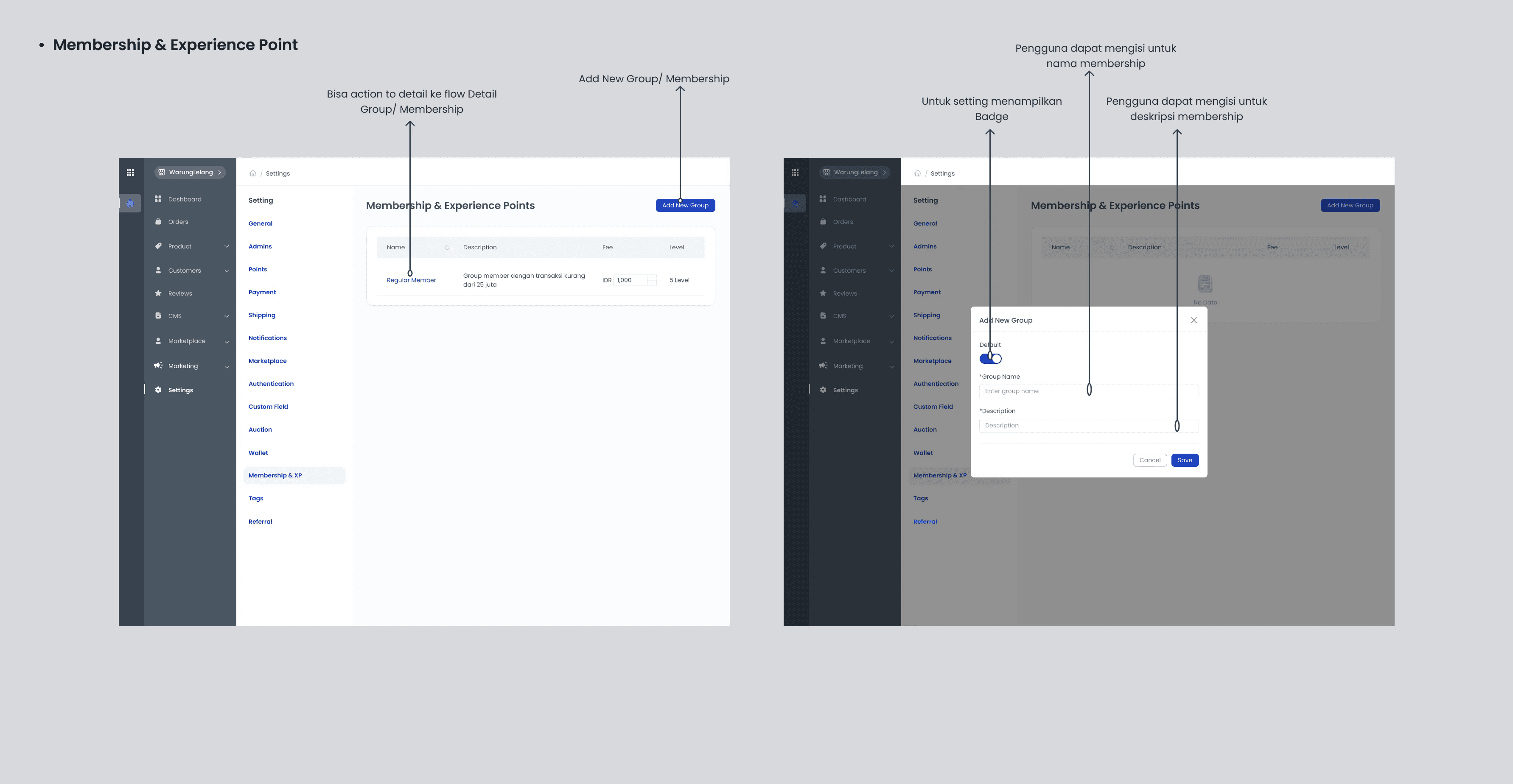
Users can create and add a new Group or Membership in the list list.
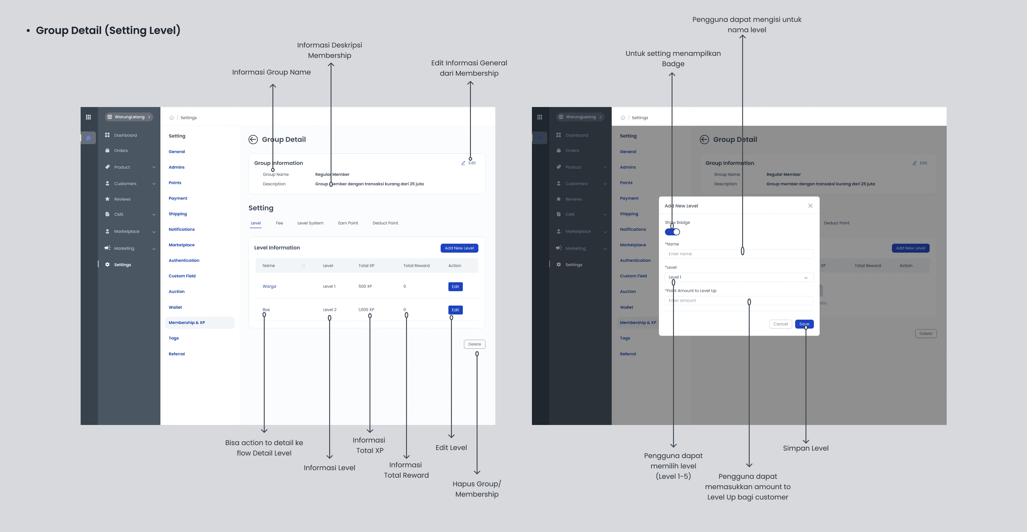
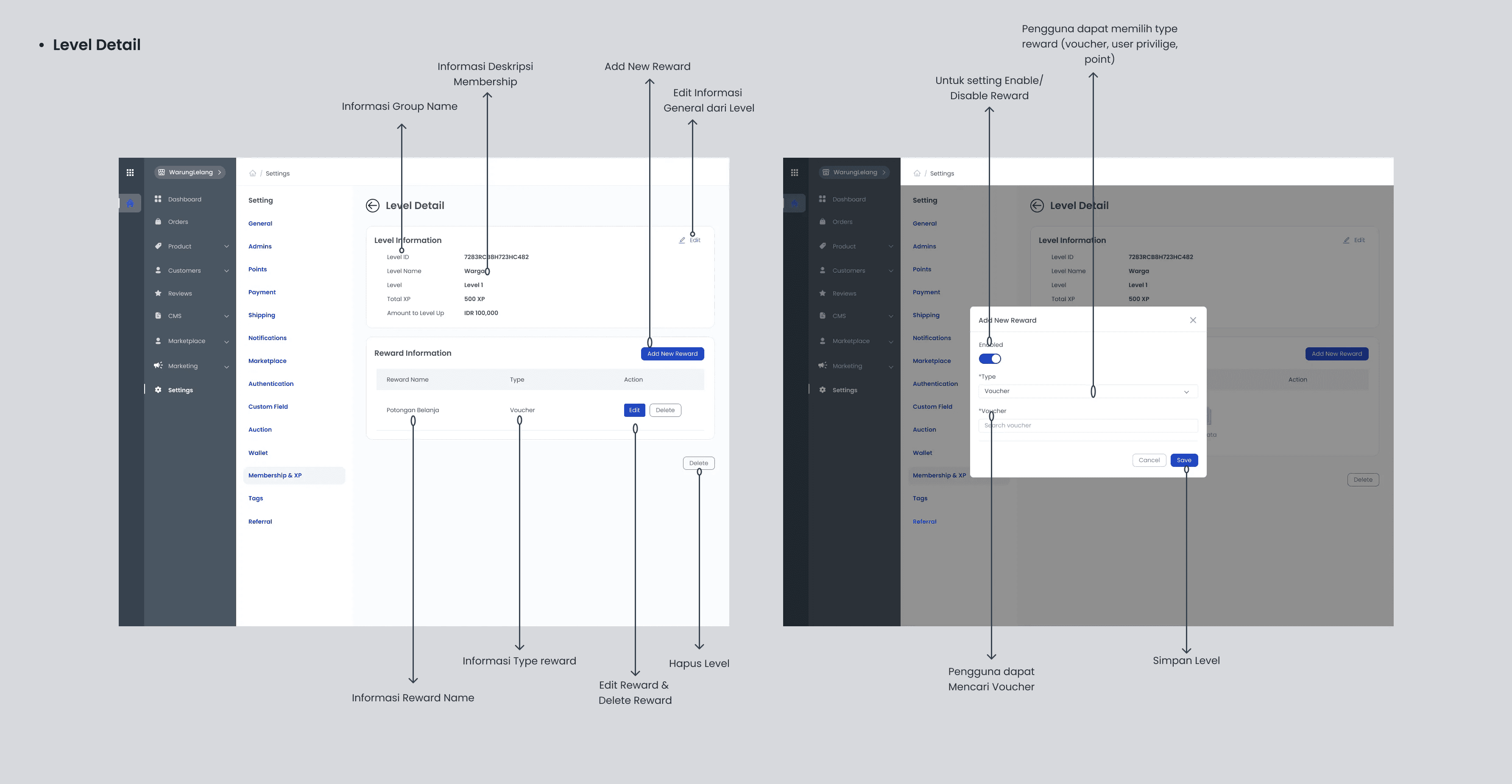
Users can optionally add levels and rewards to each membership owned by the customer.
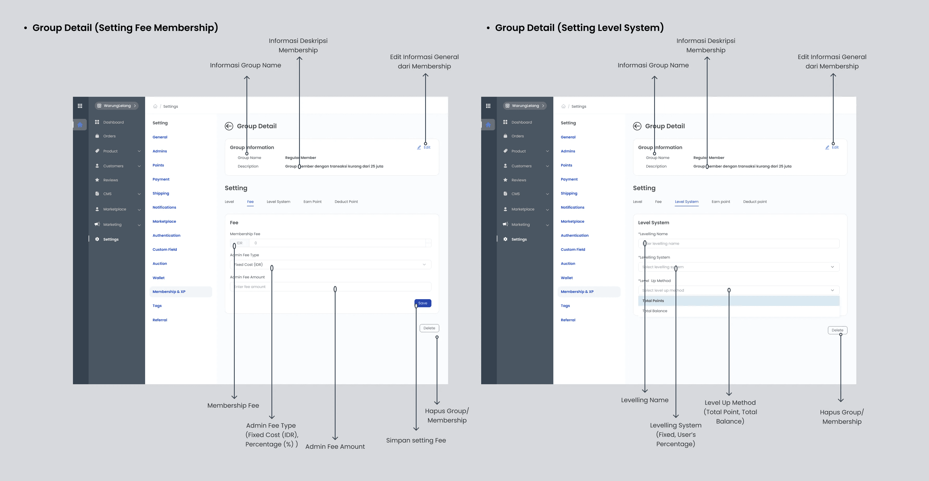
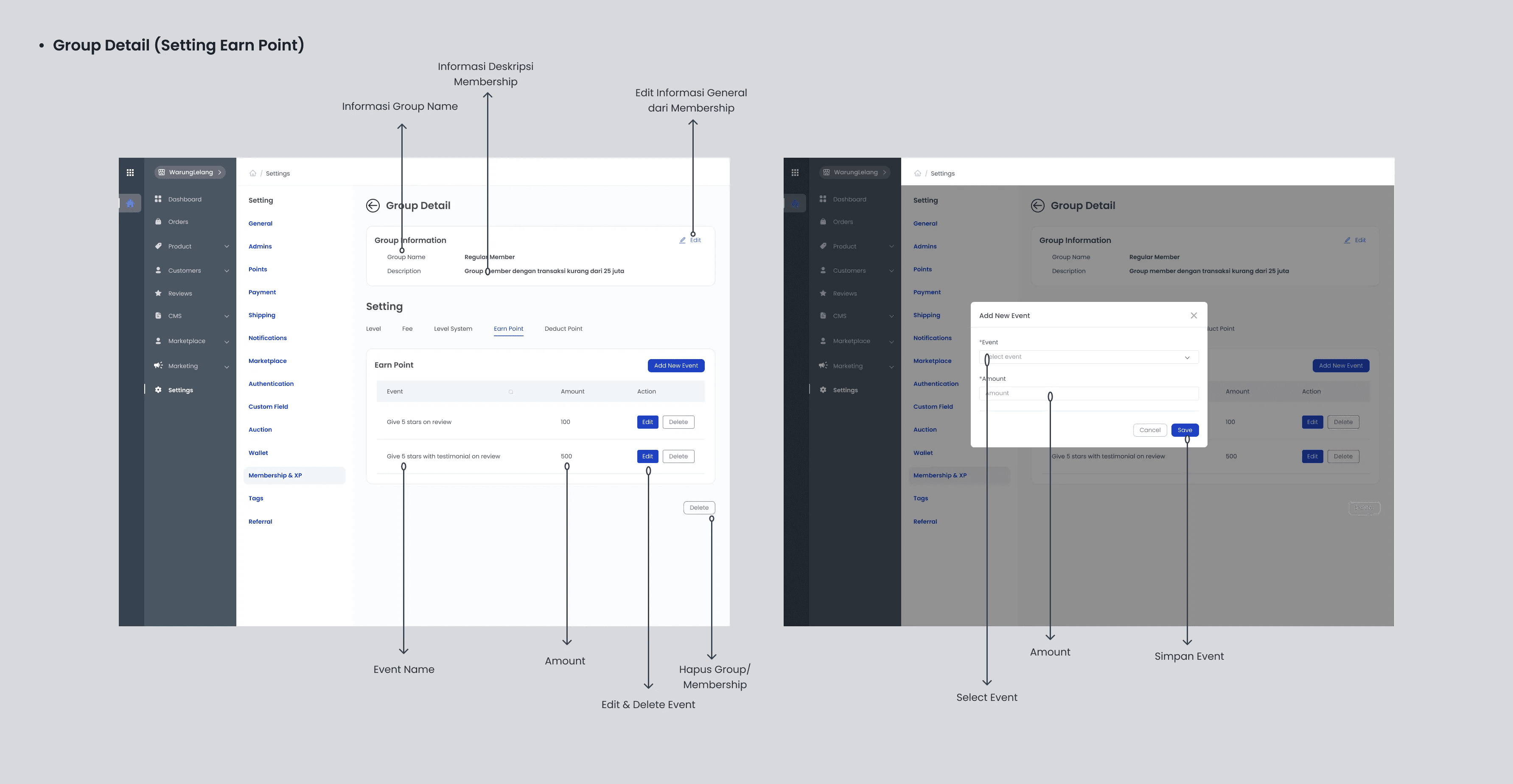
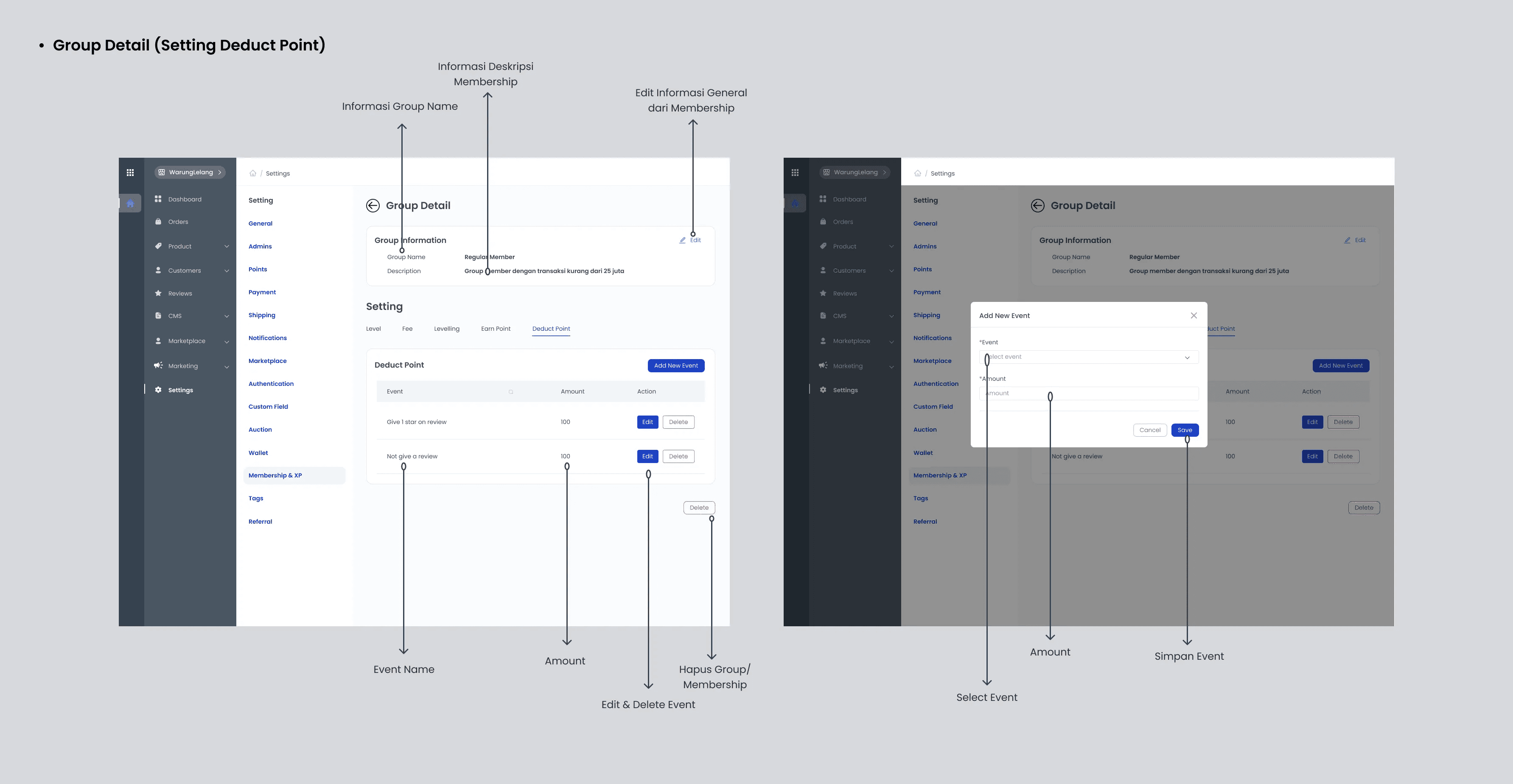
Users can manage all the membership feature needs starting from setting Level, Membership Fee, System Level, Earn Point and Deduct Point.
Constraints experienced:
The number of existing membership settings so that it must be able to easily and efficiently be used on one page at a time.
Makes the experience and display easier and more efficient on Earn Point and Deduct Point settings.
Solution of the problem :
Creating an efficient and simple alternative display but users can still access all the information on one page.
Conduct research from appropriate references and competitor dashboards.
As a UI UX Designer, things like that must be resolved and must design efficient pages so that they can produce a good user experience.
This feature is expected to make it easier for users to organize and manage the Membership and Experience Point system for each customer and provide a good experience for each user.
Mind Mapping Description
As a user, I want to easily see all the information about my membership, so I want to find it in one dashboard page.
As a user, I want to easily manage all membership feature settings in one page, so I want feature settings to be in one page with membership information.
As a user, I want to easily add and create a list of new membership lists, levels and rewards that customers will get, so it will be easier for me to organize customer memberships.
Reference
With an overview in the design of the features needed in the list above, I conducted market research on several competitors’ references and dashboards:
GamiPress
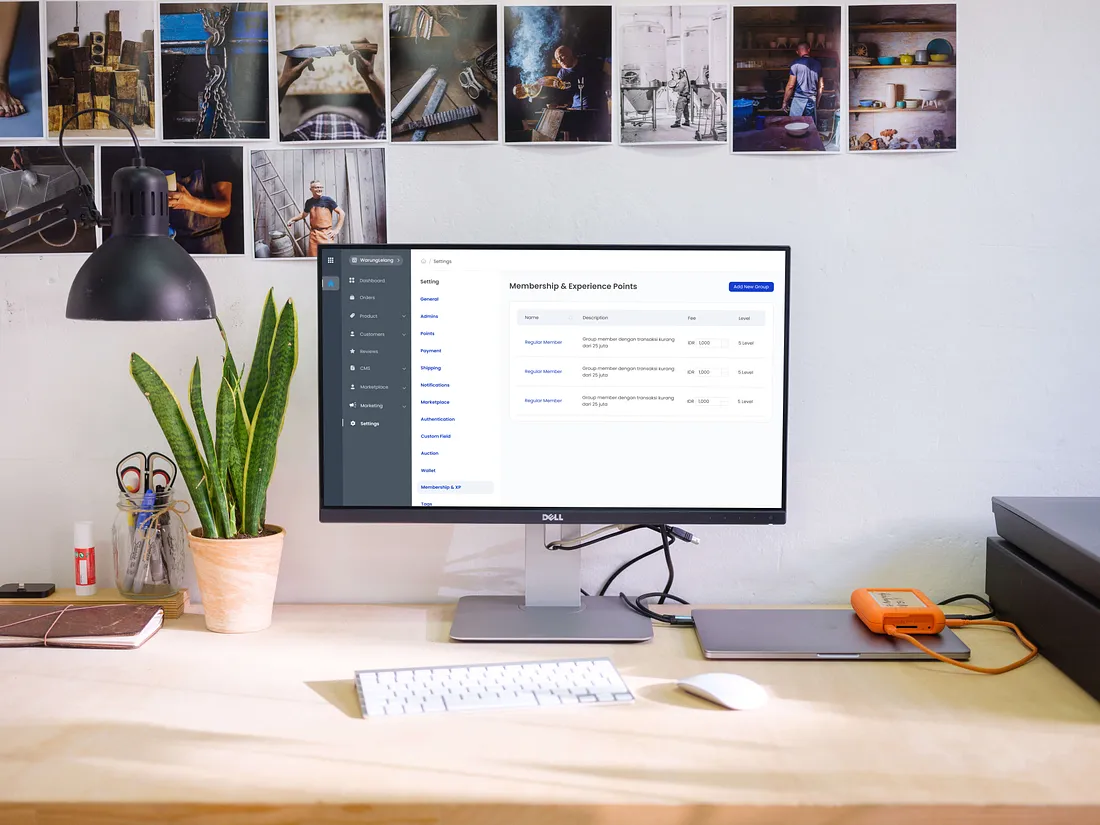
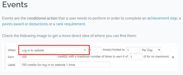
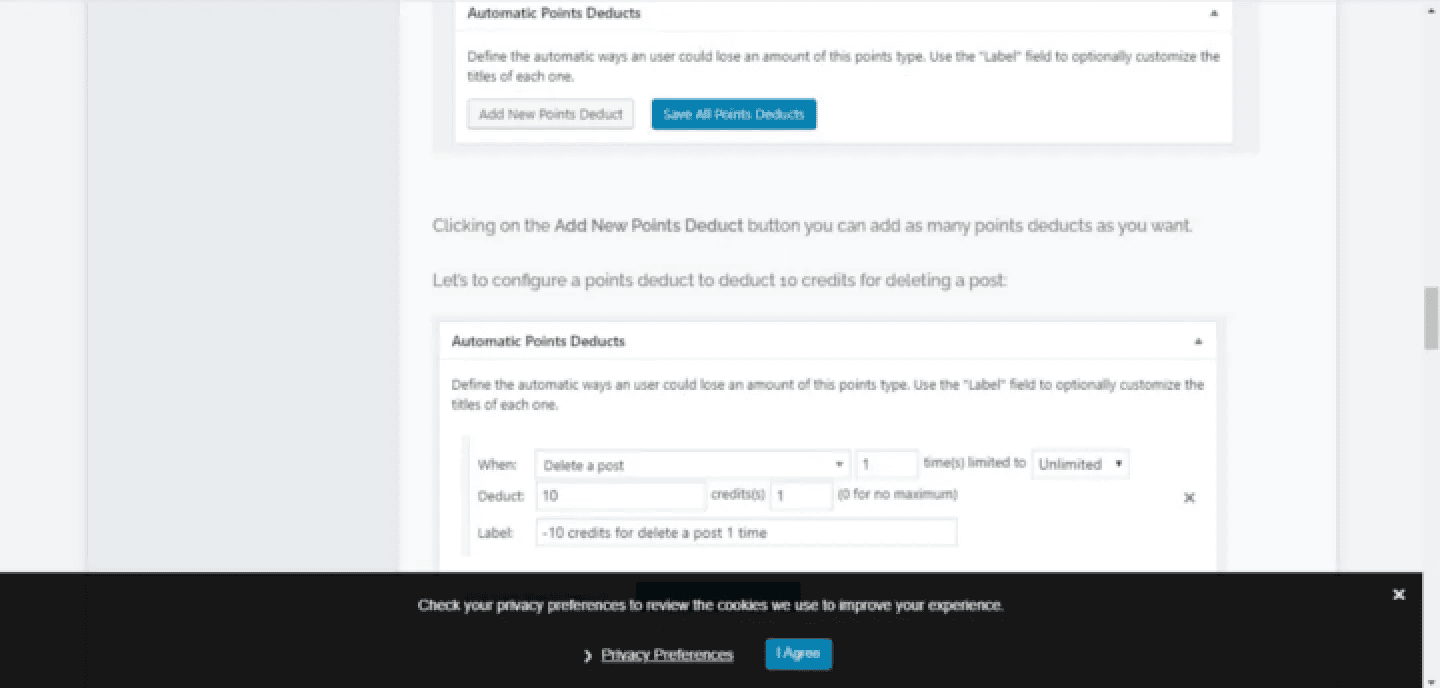
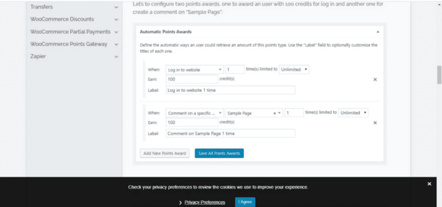
Only a few elements that I used as a reference from Gamipress, and a few modifications when implementing it into my real project. Starting from the use of Event Type, setting Earn and Dedust Points.
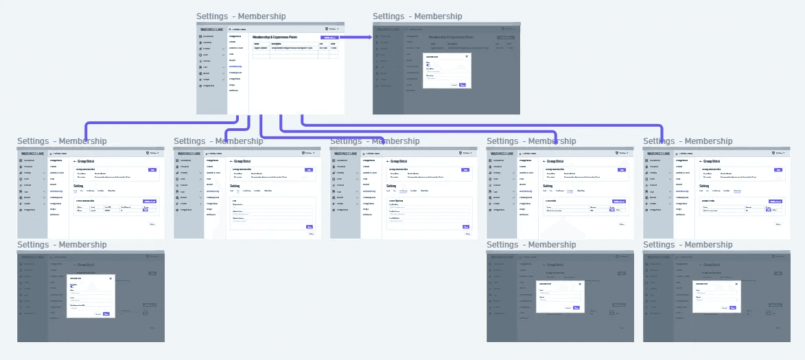
Flowchart
Flowcharts really help you to imagine the workflow in making designs on all platforms, and in my experience, I can get a timeline estimate from flowcharts. Flowcharts serve to describe, simplify a set of processes or procedures so that they are easy to understand and easy to see based on the sequence of steps of a process.
And this is the goal in the project :
Easily view Membership information,
Easy to add and organize Membership,
Easily set Level, Reward, Membership Fee, Earn Point and Deduct Point.
Wireframe
After finding solutions and references to the problems I had, I was able to start wireframing using Whimsical.
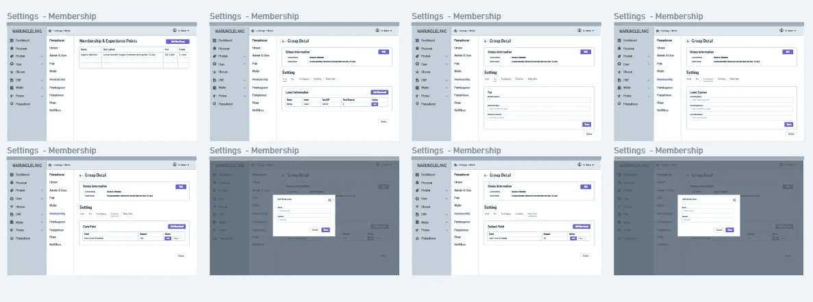
High Fidelity Screens:
I created this design using Figma.
ConclusionTo fulfill KodingWorks plan to make it easier for current users to use the dashboard, I created a design for their Membership & Experience Point settings feature. Designs are created through iterations of the design thinking process. The purpose of this design is to help motivate users to use the WarungLelang dashboard and also provide a good user experience in the process.Reader feedbackAfter reading several UX case studies, searching for the perfect methodology, I realized that no project reaches perfection and I’m pretty sure that mine is no exception.For this reason, I’d like to get some feedback from you guys whether it’s about my methodology, my writing, or anything else you think I should improve.
Thank you for reading! If you have any feedback, don’t hesitate to comment, and don’t forget to clap! 👏